Tuesday, January 31, 2012

Good Vs. Evil in the comic colour palette


When it comes to superhero comics, colour is a big deal. The psychology of colour is an important storytelling tool. Noting its importance to the comic book medium – especially in superhero comics – ColourLovers has created an infographic that highlights the colour theory employed by Marvel and DC Comics, amongst others, over the years.

While the data used for this infographic isn't scientific or fully comprehensive, including every superhero would be more or less impossible and demand too many qualifiers to make for a snappy chart. All in all the infographic is just a simple reminder of basic color theory as it relates to superhero titles. Head over to ColourLovers for the full size infographic.

Monday, January 30, 2012

Dave McKean portrait of me


I met Dave McKean at a seminar a few years back and he gladly signed my Absolute Sandman Vol 1, which I had carted around all weekend in the hope of meeting him – have you ever try carrying one of those Absolute books around for any length of time? I also managed, at a later date, to get Neil and Amanda to add their srcibbles to it too! Dave also did a quick-as-you-like portrait of me in my copy of Dustcovers: The Collected Sandman Covers 1989-1996 – so this is now one of my prized possessions.

Dustcovers is one of my go to books when I'm out of ideas on a project – it's full of astounding images that invigorate the creative juices. Actually, 100 Best Album Covers by Storm Thurgerson, is another great go to for me as well.

Saturday, January 28, 2012

Lego Moleskine notebooks

 Two of the greatest creative products together at last – Lego and Molskine – a triumph of style and marketing! It's like a peanut butter and jam sandwich for the soul. Buy here.

BTW today also marks 54th anniversary of Lego being patented.

Animated Comic Gifs

Artist Kerry Callen has transformed a series of classic comic book illustrations into clever, endlessly cycling GIFs. Click here for more loopy fun.

Friday, January 27, 2012

Thursday, January 26, 2012

Jouni's Friction


Here' a great illustration by my good friend Jouni Koponen for one of my all time favoutite SF shorts – Will McIntosh's Friction, which appears in StarShipSofa Stories: Volume 3.

Jouni also designed one of my favourite interpretations of a Neil Gaiman story: A Study in Emerald. You can download a PDF version of it here.

Wednesday, January 25, 2012

Aardman Do Batman And Superman

The Grey Hulk?

In the Incredible Hulk's debut, Stan Lee chose a grey skin tone for the Hulk because he wanted a colour that did not suggest any particular ethnic group. The printers had problems with the grey tones, resulting in varying shades of grey, and even green, to appear in the issue. After seeing the first published issue, Lee changed the Hulk's skin colour to green.

The green skin colour was used in all retellings of the Hulk's origin story, and reprints of the original story were even recoloured for the next two decades, until The Incredible Hulk vol. 2, #302 (December 1984) reintroduced the grey Hulk in flashbacks. Since then, reprints of the first issue have displayed the original grey colouring, with the fictional canon specifying that the Hulk's skin had initially been grey.

My Sandman


This is one of my numerous Neil Gaiman sketches – it's probably my favourite. It's inscribed in my The Sandman: Endless Nights. I have an unhealthy appetite for Gaiman signed stuff, much to my wife's and bank manager's displeasures.

Tuesday, January 24, 2012

A pressie from Lee


Here's a lovely little sketch sent to me by Lee Carter , a fellow Droid!

Pop over to his site and check out his portfolio.

Notes towards a practice of responsive comics


Here's the very talented Pablo Defendini -- developer, designer, artist, digital guy -- describing how "responsive" comics can be made using HTML and CSS that intelligently format themselves for a variety of devices, and addressing the writing and illustration challenges this gives rise to. He's not talking about "motion comics" -- he's talking about comics where the layouts and writing take into account a range of screen-sizes and aspect ratios.

Source: Boing Boing

History of Comic Colouring: Part 1

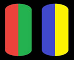
Let’s talk about old school colouring.  For 40 years color in the American comic industry used a simple, hand separated 4-colour (CMYK) system. The colors were made of three percentages of each of the three printing inks (CMY): A 25% dot, a 50% dot, and a 100% (or solid) color. The possible combinations of these tints gave colourists a palette of 64 possible colours to use  – though most used no more than half of them. Many of the darker colours were indistinguishable in print. Limiting the palette to 64 colours kept printing costs down, and were about all that would reliably reproduce on the cheap newsprint paper used for comics. Airbrushing and special colors and effects were reserved for covers, which were printed on heavier coated paper stocks.

To create a light green, for instance, a code of Y2B2 was used. This meant that 25% of Yellow (Y2) and 25% of Cyan (B2) are needed to get that colour. In order for the colour guide artists to be able to communicate with the colour separators, charts of the 64 colours with their codes were printed and distributed to the colourists.

Copies of the original art were made at 8 ½ x 11, and the colourists would write codes from the chart on the guides, which the separators used to know which colour the guide artists wanted.

The separator, which for much of comics history was Chemical Color Plate in Connecticut, would make nine acetate prints of the original art, one for each percentage of each color. The black and white artwork – originally drawn at twice the printed size, then 1½ times, and currently slightly less than that – was photographed, reduced and printed on sheets of clear acetate. Nine copies were made of each page – one for each of the three percentages of the three colours – and these were turned over to a separator often house wives paid by the page). Using the coloured artwork as a guide, areas on the acetates would be filled in with an opaque paint (Rubylith) to correspond to the colour indicated. Once the colour guides were fully “translated” and the acetates were finished, they would be photographed with appropriate screens to create a single version which included the percentage dots and the solid of one colour. These three new pieces of film, along with a fourth clean version of the art which was used to make the black, were used to make the printing plates.

But that was in the olden days – now, it’s almost all done with pixels.

Monday, January 23, 2012

Official B.P.R.D. Training Camp (AKA, Hellboy Camp)


Hells bells! What would I have done to attend a camp like this as a kid? For Summer 2012, Dark Horse Comics and Mike Mignola have collaborated with a wilderness training organization to offer a Bureau of Paranormal Research and Defense camp for kids 9-17. The weeklong program is designed to teach youth the baseline skills B.P.R.D. agents require:
Find out if you have what it takes to join an elite team of paranormal investigators combating the forces of darkness from all across the globe. We immerse you in tactical training of all forms, including survival skills in any environment (both earthly and non), martial arts and self-defense specific to praeternatural entities, hand to hand weaponry (we train foam swords, bows and more) and forensic investigation. All these key skills that every agent must have, plus you are steeped in the history of our Bureau and legacy of paranormal research.
Join the B.P.R.D! The Bureau for Paranormal Research and Defense needs your help to defend humanity against various occult horrors and paranormal threats.

Judge Dredd vs Zombies

I have to re-review Judge Dredd vs Zombies. I initially gave it a dodgy review on iTunes, which was born out of frustration of not being able to complete some levels. But after 6 weeks of tirelessly playing this game I completed it with commendations on every level and a rank in the top 5% worldwide players. An awesome game, well worth purchasing.

Sunday, January 22, 2012

Massacre For Boys

Here's page two of the Holt Bros pilot strip – originally published in Judge Dredd Megazine 261 – that I'm colouring for the Massacre For Boys Action Special.

Lovely strong linework from Steven Denton in this strip – so I've kept the colours fairly flat with minimal grads and textures. I can't wait to see it in print (only another 4 pages to colour – I hope I get them finished before the approaching deadline!).

Saturday, January 21, 2012

What I'm reading today...


This gorgeous book arrived yesterday: The Fracture of the Universal Boy by Michael Zulli. Its about time too – I paid for it in February 2011 – but I guess that's one of the downsides of backing something through Kickstarter (the upsides being too many to mention!).

Nearly 10 years in the making, The Fracture of the Universal Boy is a beautifully produced 200+ page, black and white, oversized hardcover graphic novel produced by Eidolon Fine Arts – with a signed  print included. Also, its nice to get a credit as a patron in a book like this.

Friday, January 20, 2012

The new DC Logo


DC Comics finally unveiled their new logo today – and whilst the uncolored, leaked versions  made it look like a logo for school text books publisher or an office supply company, the official design can be tailored to every individual character.  I look forward to seeing these in print – but my heart lies with the late 70s/early 80s "bullet" logo designed by Milton Glaser.

The Forbidden Colours

Don't even bother trying to make reddish green or yellowish blue – your eyes simply can't see them – remember that the next time your colouring a page!
Red-green and yellow-blue are the so-called "forbidden colors." Composed of pairs of hues whose light frequencies automatically cancel each other out in the human eye, they're supposed to be impossible to see simultaneously.
The limitation results from the way we perceive color in the first place. Cells in the retina called "opponent neurons" fire when stimulated by incoming red light, and this flurry of activity tells the brain we're looking at something red. Those same opponent neurons are inhibited by green light, and the absence of activity tells the brain we're seeing green. Similarly, yellow light excites another set of opponent neurons, but blue light damps them. While most colors induce a mixture of effects in both sets of neurons, which our brains can decode to identify the component parts, red light exactly cancels the effect of green light (and yellow exactly cancels blue), so we can never perceive those colors coming from the same place.
 Life's Little Mysteries

The Jersey Devil


Here's a fantastic image of the Jersey Devil I coloured for Walter J. Flanagan (proprietor of Jay and Silent Bob's Secret Stash). Really strong pencils on this one. Subscribe to TESD to hear Walt and gang shoot the shit.

The Dangerous Aphabet... a proposal


I've been trying to upskill by teaching myself to program iOS apps recently - its a difficult skill to teach yourself. Here's a little proof of concept that I put together of one of my favourite kids' books The Dangerous Alphabet by Neil Gaiman and Gris Grimly. I sent it on to Neil's assistant Fabulous Lorraine and Gris, who thought it was great, but, obviously, with publishing rights etc. this is as far as it can go.

Thursday, January 19, 2012

This is a print handbook

This little handbook is crammed with stuff which designers will find very helpful. Especially if you're a designer. It will cut down on the guesswork that happens when your job goes from screen to print. The handbook is printed with 4 process colours, plus one Pantone spot colour. It includes four different types of paper (uncoated, silk, gloss and the cover) and has a one colour gate folded cover with a foil.

Nice reference for any one who sends stuff to print: a print handbook.com

Meaty-Ores

Here's a great vintage ad, which appears in StarShipSofa Stories: Volume 3, by the very talented Mud! Hit him up at his blog and check out some of his other fantastic work.

Or maybe even pick up a copy of his kids' book – I Need You Blue – a story about a boy, Dewey, and his best friend, Blue (a super cool glob of water). They do everything together. Dewey finds out that friendships aren't all about giggles, sometimes tough decisions need to be made. And its all for charity too folks!

Wednesday, January 18, 2012

This is the Droid you're looking for...

Life long dream finally realised... I'm finally a 2000AD Droid! And its there in CMYK!

Thanks a million, again, Len O'Grady!

StarShipSofa Stories: Volume 1

Here's a little treat: the full online version of SSSS: Vol 1. Enjoy!

The Secret History 21 Flats

Another ongoing series I flat for Len O'Grady is Archaia's The Secret History. A Wonderful jaunt through history following four sibling immortals, or Archons, and their influence on events that shape civilization as we know it. What really makes this book special is the use of real historical events and figures throughout the story. It lends the series a layered, complex quality that makes you want to read slowly and take it all in.

Flatting samples from The Secret History 21.  
Words: Jean-Pierre Pécau. Pictures:  Igor Kordey. Final colours: Len O'Grady

Tuesday, January 17, 2012

Strange & Darke: New Blood Part 1 Flats


Flatting samples from Strange & Darke 1.  
Words: John Smith. Pictures: Colin MacNeil. Final colours: Len O'Grady

Strange & Darke: New Blood Part 1

I've just started flatting Strange & Darke: New Blood Part 4 – written by John Smith and superbly drawn by Colin MacNeil – and at the same time Part 1 has made its debut in Judge Dredd Megazine #319. Len O'Grady has graciously co-credited me as colourist on this story – the 10-year-old me who entered a competition on Blue Peter to draw a Judge Dredd strip is dancing for joy at being credited in 2000AD! Thanks Len!

Monday, January 16, 2012

Tales to Terrify

My good mates Tony C. Smith and Lawrence Santoro have put together a fantastic new Horror-themed fiction podcast – check out talestoterrify.com 

TTT will feature new fiction, classic tales, tales from the recent past by masters of the form and by voices that might be new to you. We'll also have reviews, commentary and more. So...drop in some midnight – or any time – and listen.

And I think I did a great job on that logo!

Feckin' Goblins everywhere!


Another recent acquisition – a gift for Mrs Saturate: A very rare remarked artist's proof print of Goblins from the classic 1979 Brian Froud and Alan Lee book Faeries. 25" x 34", signed with numerous sketches by Brian Froud. One of my proudest posessions!

My Tardis Cubicle


My office cubicle mod turned a few heads in the webosphere over the last few weeks, appearing on loads of sites: including geekosystem.com, failblog.org, unrealitymag.com, robotmutant.com and neatorama.com!

Nevsky The Graphic Novel


I've recently started flatting pages for David Baron's colours on IDW's Nevsky. Beautiful work - but tough!

Swamp Thing


I "acquired" this beautiful watercolour of Swamp Thing by Mike Dubisch over the weekend - endorsed by Stephen Bissette himself!

Alphabets of Desire: I


Just ordered the ninth print in Todd Klein's series – this time with words by Dave Gibbons. I don't have a wall big enough for this complete collection! Head over to Todd and purchase a copy of this limited edition print.

StarShipSofa Stories: Volume 3

Head on over to StarShipSofa and pick up a copy of StarShipSofa Stories: Volume 3. A fantastic book, if I do say so myself, featuring words by Joe Haldeman, Peter Watts, Saladin Ahmed, Lavie Tidhar and Will McIntosh amongst others, and images by Ben Green, Mike Dubisch, Thomas Crielly, Richard Case, Peter Snejbjerg, Graeme Neil Reid, Jouni Koponen and a host of other talented artists.

Gallifrey Touchy-Feely Books


Having a bit of fun with some Dr Who themed art. My kids would have loved this series of books as young 'uns! Head over to my Deviantart page to have a better look. Neil Gaiman twittered that he thought it was fun. Stephen Moffat, however, remains silent on the matter!

D&D: The Legend of Drizzt

I've been flatting for my good friend Len O'Grady (www.lenogrady.com) on this monthly title for IDW. Its amazing what Len can do with a Cintiq!

FIrst Post!

I thought I might join the blogging age finally and stick up a few bits and pieces about my love of, and work with, comics.

Expect the odd few posts about comics I work on, people I work with and art I buy!